


Never mistake a landing page for a homepage. A homepage is a lobby, sending people in many directions. A landing page has a single purpose: driving a visitor to complete one specific action. That action could be downloading a guide, reserving a demo, or buying a product. If your page includes a navigation bar, a link to your blog, or multiple buttons, it’s not a landing page. It’s a distraction. Crafting a page that genuinely converts means eliminating all clutter and focusing completely on user psychology and straightforward structure.
Here is the anatomy of a landing page that delivers results, from top to bottom.
The Headline and Subheadline
This is the first element people notice. You have roughly three seconds to answer their hidden question: “Does this solve my problem?” Don’t attempt to be witty. Be direct. Your headline should communicate the primary benefit or the exact problem you address. The subheadline then adds a layer of helpful detail.
Imagine you sell project management software. Never write “Synergize your workflow.” Instead write: “Manage remote teams without the endless email chains.” Clarity always beats cleverness. If visitors can’t immediately understand what you offer, they’ll vanish.
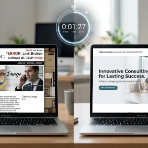
The Hero Visual
Images register faster than words. The visual at the top of your page needs to deliver instant context. For a physical product, show it in real-world use. For software, display a clean, simplified screenshot of the dashboard. Steer clear of generic stock photos depicting handshakes or people staring at laptops—those add no value and reek of lazy marketing.
The visual should strengthen your headline, not compete with it. It should make your product feel concrete and the promised outcome achievable.
The Value Proposition
Your visitors don’t care about your features. They care about what those features do for them. This is the classic features-versus-benefit distinction. Don’t just state “256-bit encryption.” Explain that it “keeps your client data safe from breaches.” Don’t simply say “cloud-based.” Say “access your files from any device, anywhere.”
Use short bullet points. People scan landing pages; they don’t read them like novels. Break up dense text blocks. Use bold typography to highlight key outcomes. Make it ridiculously easy for visitors to grasp why your offer matters to them.
Social Proof and Trust Signals
Whether you sell to businesses or everyday consumers, buyers hate risk. They need confirmation that others have tried your offering and succeeded. Place trust signals thoughtfully throughout the page—not just crammed at the bottom. Show recognizable client logos if you have permission. Include brief, specific testimonials.
A quote that says “Great service!” is meaningless. A quote that says “This tool cut our reporting time in half” is persuasive. Whenever feasible, attach a name, photo, and company title to make the testimonial verifiable. Authentic proof reduces the perceived danger of taking action.
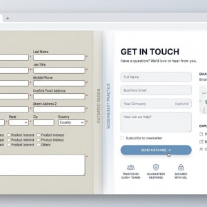
The Form and Call to Action
This is the decisive moment—and the place where most conversions die due to friction. Examine your form fields with a critical eye. Do you honestly need the visitor’s phone number, company size, and job title just to deliver a PDF? Probably not. Every extra field chips away at your conversion rate. Ask only for what is strictly necessary to start the conversation.
Then study your button text. “Submit” is a terrible choice—it describes a mechanical action, not a benefit. Use action-oriented, benefit-focused language like “Get My Free Guide,” “Start My Trial,” or “Book a 15-Minute Call.” Make the button a contrasting color so it jumps off the page.
The Missing Navigation
A true landing page should not include a standard website header or footer. Remove all links to your About Us page, your blog, and your contact form. The objective is to keep visitors inside a focused tunnel. If they get distracted and click away to read a blog post, they may never return to complete your form. The only ways to leave should be submitting the form or closing the tab. Remove every exit ramp that doesn’t serve your primary goal.
When to Bring in Experts
You can build a simple landing page using a drag-and-drop builder. But if you need consistent, high-volume leads, the small details make a huge difference. An experienced website designer Singapore understands conversion rate optimization—how to use white space, typography, and visual hierarchy to guide the eye directly toward your form. A talented website designer also ensures your page loads instantly on mobile devices, where a huge slice of your traffic will arrive.
If your requirements are more sophisticated, teaming up with a web design company is a wise investment. A reliable web design company can set up A/B testing to identify which headlines and visuals drive better results. They can integrate your form directly with your CRM, so leads are routed to your sales team without delay. They also make sure the underlying code is clean, fast, and secure. You hire a web design company to turn your traffic into measurable business outcomes. Even a skilled website designer can help you refine button colors, form field order, and mobile responsiveness. Ultimately, working with a web design company saves you from months of fruitless experimentation.
Final Thoughts
A high-converting landing page is not a masterpiece of design—it’s a utilitarian tool. It respects the visitor’s time, answers their questions quickly, and makes the next step obvious. Build it with one goal in mind. Remove anything that doesn’t support that goal. Then test it, measure the results, and iterate. Conversion is not a one-time achievement. It’s a continuous process of making things marginally easier for the person on the other side of the screen.